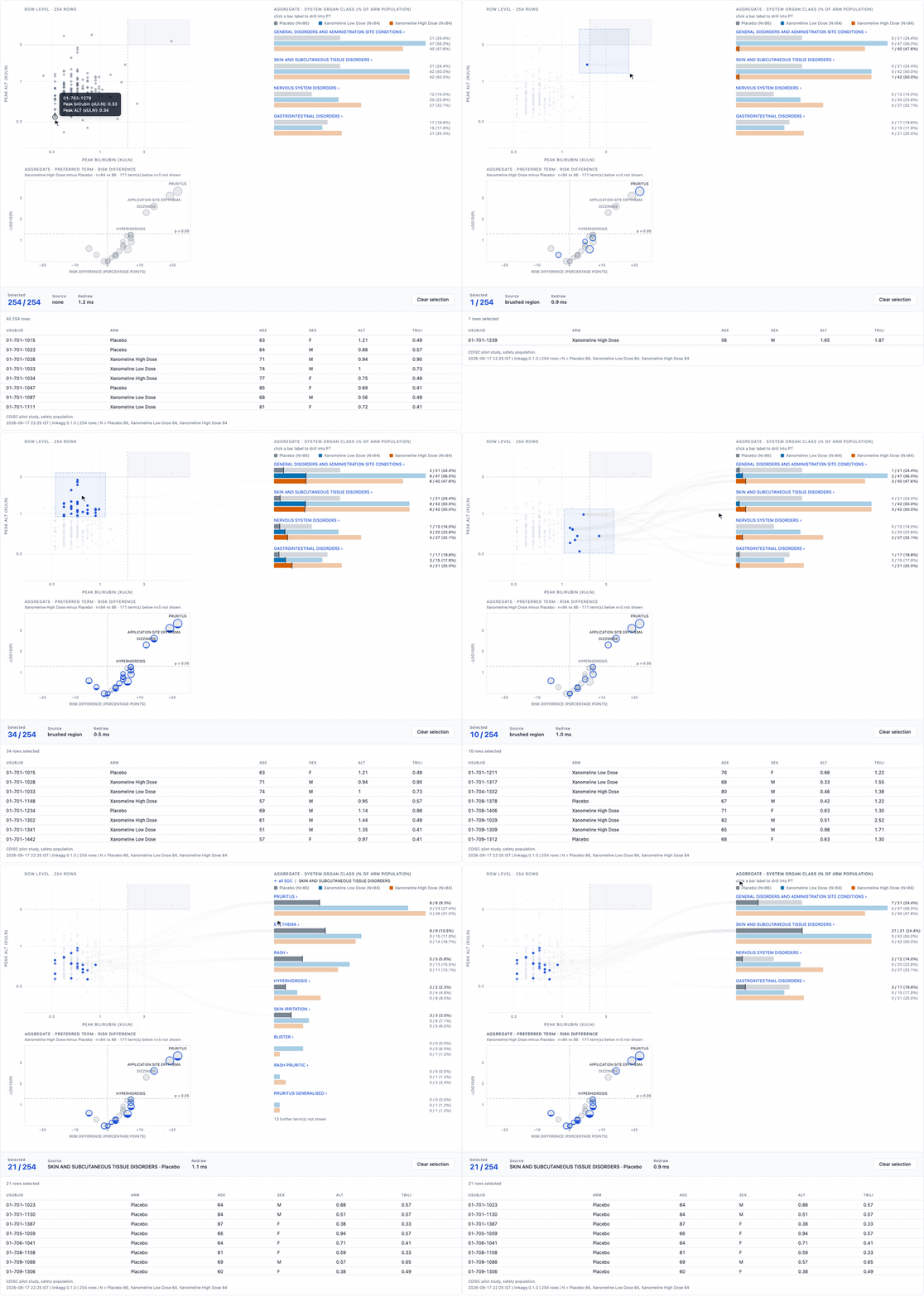
Brush a row-level display and watch aggregate displays fill in proportion to the rows you selected.
Aggregate views such as bar charts summarise many rows into one mark.
linkagg keeps hold of the row-to-group mapping, so a
selection made on individual rows resolves back through it and each mark
fills to the share of its own rows selected.
The technique is not new. It is usually called proportional
brushing, and Tableau does it with set actions, Vega-Lite ships
a layered crossfilter-highlight
example that layers all the data under a filtered copy of it, and
glue does it in Python. Any of those is a reasonable choice, and in R
the same Vega-Lite spec can be rendered through vegawidget
or altair.
What is missing is not the technique but a version of it shaped for
subject-level clinical safety data. crosstalk, the standard
way of linking R htmlwidgets, states plainly that it does not cover
aggregate views and advises
authors to steer clear. clinDataReview and
safetyGraphics link a bar to the subjects behind it but
show which subjects, not what share of the bar a selection covers, and
both want a server.
So the case for this package is narrow and practical:
Output is an htmlwidget. It works inside Shiny, and it saves to a single self-contained HTML file with no server, so an interactive figure can be emailed, archived, and opened offline in five years like a static one.
Real CDISC pilot data, recorded from the figure itself.
Hover a mark and it names the subject. Drag out a box and then take hold of it: the box stays live, so you can slide it around the plot and the bars, the counts and the listing underneath all follow it while it moves. That is what makes it exploratory rather than a query, since you can sweep a region and watch which organ classes respond instead of guessing, releasing, looking, and guessing again. The volcano beneath the scatter answers to the same selection, each of its points being one preferred term and filling from the bottom like a bar. Click a bar rather than its label and the traffic runs the other way, that bar’s own subjects lighting up in the scatter and becoming the listing. Click a bar’s label instead and it walks down the MedDRA hierarchy, organ class to preferred term to the term the investigator wrote, with the breadcrumb walking back up.
Early. Not on CRAN. Passes R CMD check clean (0 errors,
0 warnings, 0 notes) on R 4.5.3, with 129 passing tests. Runs on real
trial data (see On a real trial below), but has not yet been
used by anyone for a review question of their own, and is not validated
for regulated use.
The layout is fixed: row-level displays on the left, aggregate displays on the right, listing below. Treat this as a working prototype, not a stable API.
# install.packages("remotes")
remotes::install_github("renit12345-ship-it/linkagg")Three worked examples ship with the package. Each opens a figure in the RStudio Viewer and leaves its data and the figure behind, under its own names, so you can source all three in one session without them treading on each other.
library(linkagg)

source(system.file("examples/pbc-trial.R",  package = "linkagg"))  # real trial
source(system.file("examples/cdisc-adam.R", package = "linkagg"))  # real ADaM
source(system.file("examples/edish-demo.R", package = "linkagg")) # simulated| example | data | leaves behind |
|---|---|---|
pbc-trial.R |
Mayo Clinic PBC trial, 312 randomised patients, via
survival |
pbc_pat, fig |
cdisc-adam.R |
CDISC pilot ADSL / ADAE / ADLB, via
pharmaverseadam |
cdisc_saf, fig |
edish-demo.R |
simulated, 240 subjects, exercises every display | demo_adsl, fig |
The package ships a Shiny application that shows the linking working in both directions. Run it with one call:
linkagg::run_linkagg_app()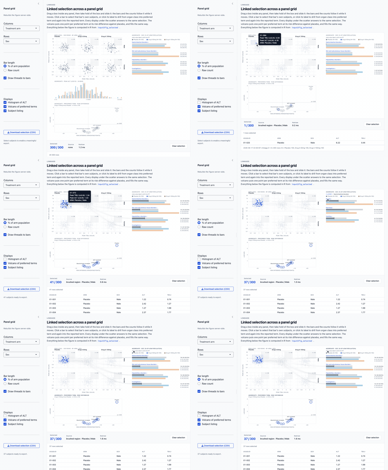
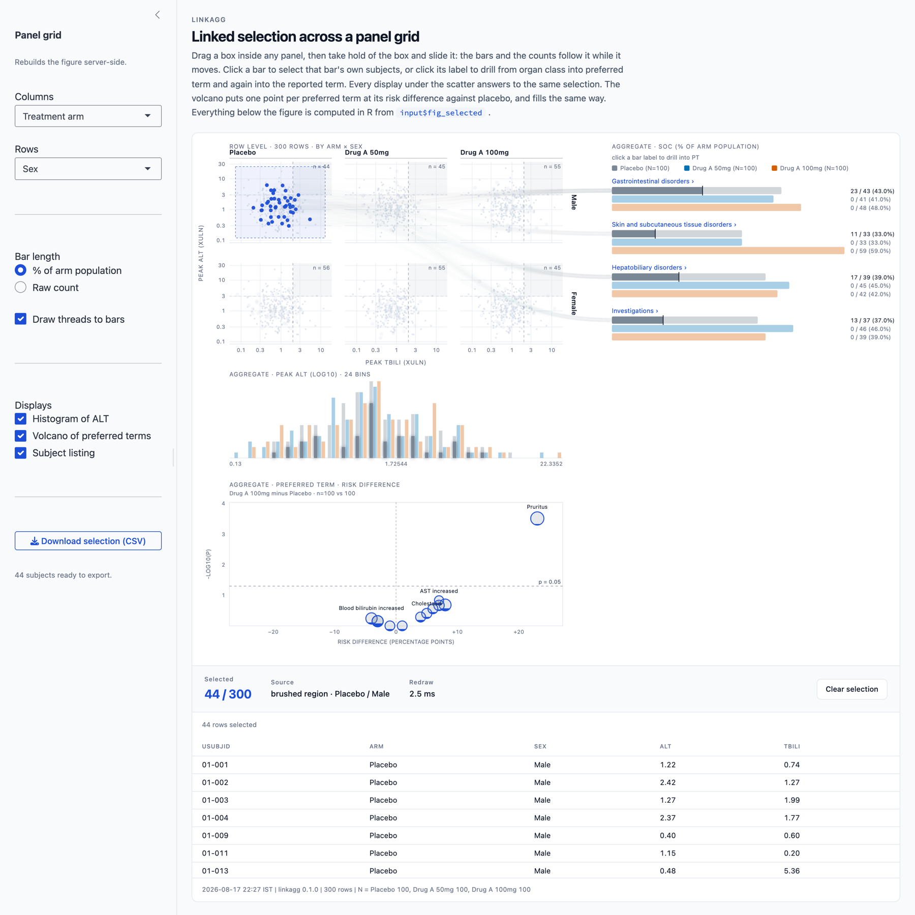
Shiny drives the figure. The sidebar chooses the grid variables, the bar denominator and whether threads are drawn, and the figure is rebuilt server side.
The figure drives Shiny. The brushed selection
arrives back in R as input$fig_selected, a character vector
of key values, and everything below the figure is computed from it: the
summary cards, the arm by sex crosstab, and a CSV export of exactly the
subjects selected. Those last two sit below the fold on a shorter
window, so scroll if you do not see them.
The figure carries every display the package offers: the panel grid, the histogram, the bars with their arm splits and denominators, the volcano, and the subject listing. Each is an optional step in the pipeline, so the sidebar can add and drop them and the figure relays itself around what is left. The bars behave as they do anywhere else: click one to select its own subjects, or click its label to walk down from organ class to preferred term to the reported term, and back out again.
In the shot above, one cell of the grid is brushed, so the selection is the 44 male placebo subjects; the source line names the cell, each bar reports the share of its own subjects caught, and the export is ready with those 44.
The application source is inst/shiny/app.R, which is
worth reading if you want to wire the widget into an app of your
own.
pbc-trial.R runs the figure on the Mayo Clinic primary
biliary cholangitis trial: real patient data from a real randomised
study of D-penicillamine against placebo, 1974 to 1984, 312 randomised
patients, distributed in the survival package and described
in Fleming and Harrington (1991).
Two things come out of it that a static safety pack does not give you.
The volcano finds nothing, correctly. No clinical finding separates the arms, the smallest p being 0.071, which is what randomisation of baseline findings should look like. A display that manufactures a signal here would be worse than useless.
Brushing answers an overlap question. Select the high-bilirubin, high-AST corner and each finding fills to the share of its own patients you just caught. For the region bilirubin >= 3 mg/dL and AST >= 100 U/L, 87 of 312 patients:
| finding | patients | in the region | share | enrichment |
|---|---|---|---|---|
| Ascites | 24 | 14 | 58.3% | 2.09x |
| Oedema | 49 | 26 | 53.1% | 1.90x |
| Spider naevi | 90 | 43 | 47.8% | 1.71x |
| Stage 4 | 109 | 47 | 43.1% | 1.55x |
| Hepatomegaly | 160 | 64 | 40.0% | 1.43x |
Ordered by clinical severity: the decompensation signs concentrate in the high-bilirubin patients, the least specific sign least. A frequency table gives you “24 patients had ascites” and “87 had bilirubin >= 3” as separate rows and cannot tell you that most of the ascites patients are the same people. That overlap is the thing this package exists to show.
This sketch uses your own data. For something that runs as it stands,
source one of the examples above; each leaves its data frame and the
figure behind under its own names (demo_adsl,
cdisc_saf, pbc_pat, and fig).
library(linkagg)

# adsl is your own subject-level data, one row per subject, restricted to the
# safety population. adsl$SOC is a list-column: each element is that subject's
# system organ classes, so a subject with events in three SOCs contributes to
# three bars.

fig <- linkagg(adsl, USUBJID) |>
  view_points(TBILI, ALT,
              log_x = TRUE, log_y = TRUE,
              x_lab = "Peak total bilirubin (xULN)",
              y_lab = "Peak ALT (xULN)",
              zone  = list(x = 2, y = 3, label = "REFERENCE THRESHOLD")) |>
  view_bars(SOC, by = ARM, label = "System organ class") |>
  view_table(cols = c("USUBJID", "ARM", "ALT", "TBILI")) |>
  as_linkagg_widget(caption = "ADSL / ADAE, safety population, cut 2026-06-30")

htmlwidgets::saveWidget(fig, "figure.html", selfcontained = TRUE)
selfcontained = TRUE requires pandoc. RStudio bundles
its own, so this works from the RStudio console with no setup. From a
plain terminal Rscript it will fail with “requires pandoc”
unless you point R at one first:
Sys.setenv(RSTUDIO_PANDOC =
"/Applications/RStudio.app/Contents/Resources/app/quarto/bin/tools/aarch64")by splits every group into one sub-bar per arm, which is
how safety displays are actually read. Nobody reviews a pooled count of
58 subjects with a gastrointestinal event; they review 22 on placebo
against 36 on active.
With by set, bar length is the percentage of that arm’s
analysis population, matching the denominator convention of a standard
adverse event summary. The denominator defaults to the number of rows
per arm in data, which is correct when data is
the analysis population. When it isn’t, say so explicitly:
view_bars(SOC, by = ARM, population = c(Placebo = 80, "Drug A" = 82))
view_bars(SOC, by = ARM, population = adsl_full)   # counted, not taken as sizes
A missing or zero denominator is an error rather than a silent
NaN, because a percentage against the wrong denominator is
the classic way these displays go wrong and it is not something to
discover in review.
Selecting rows fills each arm’s sub-bar to the share of that arm’s affected subjects who are selected, so the comparison across arms stays honest.
facet draws one small multiple per level on shared
scales, so panels are comparable. Brushing acts within a single panel,
which is the correct semantics: selecting the high-ALT corner of the
high-dose panel should not sweep in placebo subjects.
view_points(TBILI, ALT, log_x = TRUE, log_y = TRUE, facet = ARM)Rows whose facet value is outside facet_levels are
marked rather than silently dropped, so a typo in a level name does not
quietly remove subjects.
Add facet_row for a full grid: one column per level of
facet, one row per level of facet_row.
view_points(TBILI, ALT, log_x = TRUE, log_y = TRUE,
            facet = ARM, facet_row = SEX)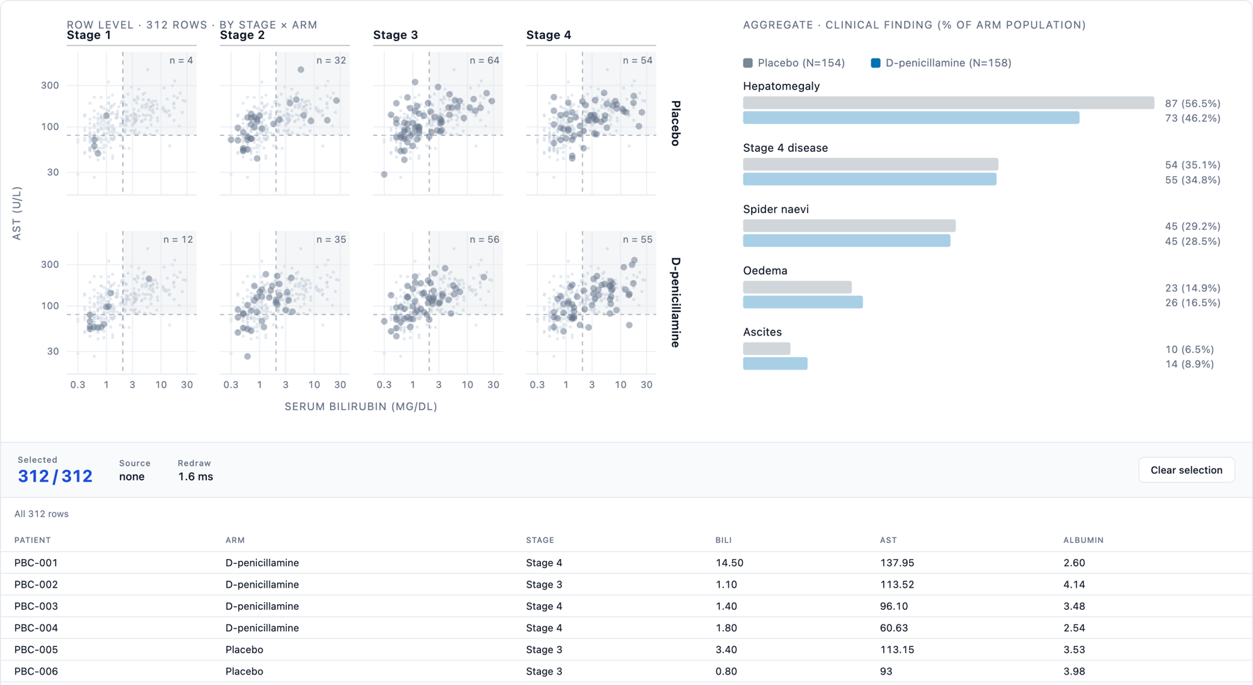
The PBC trial as a grid: disease stage across, treatment arm down. Every panel also carries the whole cohort faintly behind its own patients, so a cell can be read against the distribution as a whole and not only against itself.
Scales stay shared across the whole grid, so every panel is
comparable with every other, and a brush still selects only the cell you
dragged over: the subjects in that arm and that sex. Internally
a panel is one index, row * n_columns + column, so the grid
reuses the same selection path as a single strip of panels rather than
introducing a second one.
The view functions take a bare column name, a string, or any expression that evaluates to a string. The last form is what makes them usable from Shiny, where the column is chosen by the user:
view_points(spec, TBILI, ALT, facet = input$fcol, facet_row = input$frow)An expression evaluating to NULL means “no column”, so
an optional facet or arm can be switched off without building a
different call. A bare name is always taken literally,
so a variable that happens to share a column’s name can never silently
redirect a reference. Wrap it in parentheses when you do want the
variable’s value: by = (arm_col).
drill gives the levels below the grouping, coarse to
fine. Click a bar label to descend, click any step of the breadcrumb to
come back to that level. Arm splits, denominators and partial fills all
work the same way at every depth.
view_bars(SOC, by = ARM, drill = PT)            # one level
view_bars(SOC, by = ARM, drill = c(PT, LLT))    # the MedDRA hierarchy
The second form is the one a safety reviewer actually walks: organ
class, to preferred term, to the term the investigator wrote down. On
the CDISC pilot study,
Cardiac disorders > Myocardial infarction holds 4
placebo, 2 low-dose and 4 high-dose subjects, and drilling once more
splits that preferred term into what was really reported:
| lowest level term | Placebo | Low | High |
|---|---|---|---|
| Myocardial infarction | 1 | 1 | 2 |
| Inferior myocardial infarction | 1 | 0 | 1 |
| Myocardial infarct | 2 | 0 | 0 |
| Anteroseptal infarction | 0 | 1 | 0 |
| Septal myocardial infarction | 0 | 0 | 1 |
| total | 4 | 2 | 4 |
Two of those rows are the same event spelled differently and three are anatomically distinct infarctions. A preferred-term table shows one row of ten; it cannot show you that.
Every drill column must pair positionally with the group: element
j of PT[[i]] is the term for element
j of SOC[[i]]. Mismatched lengths are an error
naming the offending row and column, because a silent misalignment here
would attribute events to the wrong organ class.
The case crosstalk’s own documentation names as unsupported, since each bar stands for many rows. A selection fills each bin from the baseline up.
view_hist(ALT, bins = 30, by = ARM, log = TRUE)Log binning drops non-positive values, warns with the count, and reports the number of unbinned rows on the display rather than passing over them.
view_volcano(PT, by = ARM, ref = "Placebo", comp = "Drug A", min_n = 5)One point per term, placed by risk difference (comparison minus
reference, in percentage points) against -log10(p) from
Fisher’s exact test. Volcano and dot plots are the two displays content
experts favour for summarising harms in a trial, so this is the shape a
safety reviewer already reads.
Each point stands for many subjects, which makes it an aggregate mark in the sense this package exists for: with a selection active every point fills from the bottom in proportion to the share of its own subjects selected. Brushing the Hy’s law corner of an eDISH plot and reading the volcano answers a question no static safety pack contains: which adverse event signals those subjects actually carry. In the bundled example, brushing 15 subjects from that corner fills the four liver terms to 17 to 29% and every background term to under 6%.
The recognised weakness of a volcano is that it shows an effect
estimate without its precision: a term seen in two subjects can sit as
far from the origin as one seen in fifty. Two things guard against that
here. Point area is proportional to the number of subjects contributing,
so sparse terms look sparse; and min_n drops the thinnest
terms while printing how many were dropped on the display rather than
passing over them silently. The p = 0.05 line is a guide to
the eye with no multiplicity adjustment implied.
Selection is a Uint8Array mask plus an
Int32Array of selected indices, not a Set.
Point pixel positions are precomputed once, so brushing compares numbers
rather than running an inverse scale per point. Above
canvas_threshold rows (6,000 by default) the scatter
renders to canvas.
The marks are drawn in two layers. Every mark goes on a base layer, painted once per layout. Only the current selection goes on the layer above it, and a selection dims the base with a CSS opacity change rather than repainting it. The cost of a brush is therefore the size of the selection, not the size of the dataset, which is what keeps a million rows responsive.
Measured end to end on one machine: building the spec in R, writing the file, and the redraw the browser reports after a brush.
| subjects | spec | file size | brush redraw |
|---|---|---|---|
| 254 (CDISC pilot) | 0.02 s | 0.4 MB | 3 ms |
| 10,000 | 0.03 s | 0.6 MB | 5 ms |
| 200,000 | 0.85 s | 12.3 MB | 45 ms |
| 1,000,000 | 4.5 s | 61.3 MB | 113 ms |
A million subjects redraw in about a tenth of a second, so drawing is no longer what limits the size of a figure.
A brush resolves while it is still being dragged, and equally while an existing box is being moved or resized, coalesced to one update per animation frame, and the cost of each of those updates is the size of the selection rather than of the dataset. On a million subjects, sweeping out a corner holding seventeen thousand of them updates in around 3 ms per frame. Dragging until nearly the whole cohort is inside the box reaches about 180 ms, which is the worst case and an odd thing to want. Only the threads wait for the release, being the one part whose cost is not bounded by the listing’s row cap.
What limits it now is the file. The row-level data travels inside the HTML, at roughly 60 MB per million subjects, so a million-subject figure is a 61 MB file. That is fine to open and awkward to email, and ten million would be around 600 MB, which is not a figure you can archive or send at all. Cohorts of that size want the aggregation done in R, with the widget receiving the aggregate counts and a sample of the row layer rather than every row.
as_linkagg_widget(stamp = TRUE) is the default and
writes a footer line recording the render time, package version, row
count and per-arm denominators. Add caption for the dataset
and any subset applied. Keep both on for anything you intend to share or
archive, since the whole argument for a single-file interactive figure
is that it can be treated like a controlled output.
ui <- fluidPage(linkaggOutput("fig", height = "760px"), verbatimTextOutput("n"))

server <- function(input, output) {
  output$fig <- renderLinkagg({
    linkagg(adsl, USUBJID) |>
      view_points(TBILI, ALT, log_x = TRUE, log_y = TRUE) |>
      view_bars(soc)
  })
  output$n <- renderPrint(length(input$fig_selected))
}
The current selection arrives as
input$<outputId>_selected, a character vector of key
values, or NULL when nothing is selected.
The bundled demo app shows both directions at once:
linkagg::run_linkagg_app()Shiny drives the figure: sidebar controls pick the grid variables,
the bar denominator and whether threads are drawn, and the figure is
rebuilt server-side. The figure drives Shiny: the brushed selection
feeds the summary cards, an arm-by-sex crosstab and a CSV download, all
computed in R from input$fig_selected.
One gotcha: linkaggOutput(height = ) does not resize the
figure, it only sizes the container. If the figure is taller than the
container it overlaps whatever follows. Match the two by ending the pipe
with an explicit as_linkagg_widget(height = 800) and
setting the same value on the output.
By default, selecting rows draws animated threads from each selected
row to every group it belongs to. This is the mapping the package exists
to keep, made visible. Turn it off with
linkagg(..., threads = FALSE) for a quieter figure. Threads
are capped (thread_cap) and are suppressed when the browser
reports prefers-reduced-motion.
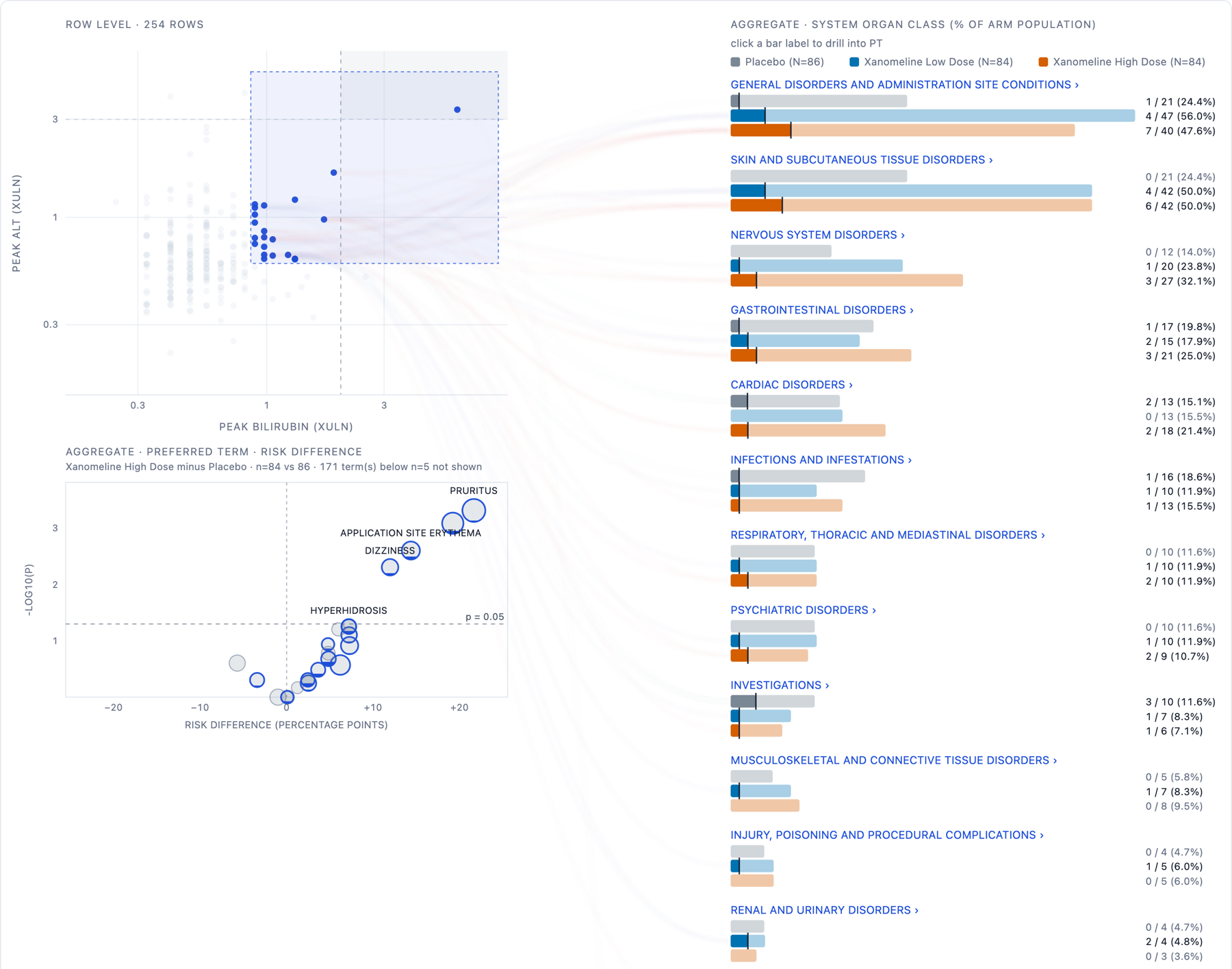
The figure on real CDISC data, and the same trial as a panel grid:
A figure holds one scatter, one bar display, one histogram and one volcano, in fixed positions. Boxplots and time to onset displays are not implemented. Above a million subjects the size of the self contained file, not the redraw, is what sets the practical ceiling.
The package is a research tool. It is not qualified software and carries no validation package, so it is suited to exploration and to the figures that support a discussion, rather than to producing a regulatory deliverable.
MIT. Bundles d3 v7.9.0 (ISC) in
inst/htmlwidgets/lib/.